Story behind the Paper: Functional biogeography of ocean microbes

Guest Post by Russell Neches, a PhD Student in my lab and Co-Author on a new paper in PLoS One.  Some minor edits by me.


For this installment of the Story Behind the Paper, I’m going to discuss a paper we recently published in which we investigated the geographic distribution of protein function among the world’s oceans. The paper, Functional Biogeography of Ocean Microbes Revealed through Non-Negative Matrix Factorization, came out in PLOS ONE in September, and was a collaboration among Xingpeng Jiang (McMaster, now at Drexel), Morgan Langille (UC Davis, now at Dalhousie), myself (UC Davis), Marie Elliot (McMaster), Simon Levin (Princeton), Jonathan Eisen (my adviser, UC Davis), Joshua Weitz (Georgia Tech) and Jonathan Dushoff (McMaster).

Using projections to “see” patterns in complex biological data

Biology is notorious for its exuberant abundance of factors, and one of its central challenges is to discover which among a large group of factors are important for a given question. For this reason, biologists spend a lot of time looking at tables that might resemble this one :

sample A
sample B
sample C
factor 1
3.3
5.1
0.3
factor 2
1.1
9.3
0.1
factor 3
17.1
32.0
93.1


Which factors are important? Which differences among samples are important? There are a variety of mathematical tools that can help distill these tables into something perhaps more tractable to interpretation. One way or another, all of these tools work by decomposing the data into vectors and projecting them into a lower dimensional space, much the way object casts a shadow onto a surface. 


The idea is to find a projection that highlights an important feature of the original data. For example, the projection of the fire hydrant onto the pavement highlights its bilateral symmetry.

So, projections are very useful. Many people have a favorite projection, and like to apply the same one to every bunch of data they encounter. This is better than just staring at the raw data, but different data and different effects lend themselves to different projections. It would be better if people generalized their thinking a little bit.

When you make a projection, you really have three choices. First, you have to choose how the data fits into the original space. There is more than one valid way of thinking about this. You could think about it as arranging the elements into vectors, or deciding what “reshuffling” operations are allowed. Then, you have to choose what kind of projection you want to make. Usually people stick with some flavor of linear transformation. Last, you have to choose the space you want to make your projection into. What dimensions should it have? What relationship should it have with the original space? How should it be oriented?

In the photograph of the fire hydrant, the original data (the fire hydrant) is embedded in a three dimensional space, and projected onto the ground (the lower dimensional space) by the sunlight by casting a shadow. The ground happens to be roughly orthogonal to the fire hydrant, and the sunlight happens to fall from a certain angle. But perhaps this is not the ideal projection. Maybe we’d get a more informative projection if we put a vertical screen behind the fire hydrant, and used a floodlight? Then we’d be doing the same transformation on the same representation of the data, but into a space with a different orientation. Suppose we could make the fire hydrant semi-transparent, we placed it inside a tube-shaped screen, and illuminated the fire hydrant from within? Then we’d be using a different representation of the original data, and we’d be doing a non-linear projection into an entirely different space with a different relationship with the original space. Cool, huh?

It’s important to think generally when choosing a projection. When you start trying to tease some meaning out of a big data set, the choice of principal component analysis, or k-means clustering, or canonical correlation analysis, or support vector machines, has important implications for what you will (or won’t) be able to see.

How we started this collaboration: a DARPA project named FunBio

Between 2005 and 2011, DARPA had a program humbly named The Fundamental Laws of Biology (FunBio). The idea was to foster collaborations among mathematicians, experimental biologists, physicists, and theoretical biologists — many of whom already bridged the gap between modeling and experiment. Simon Levin was the PI of the project and Benjamin Mann was the program officer. The group was large enough to have a number of subgroups that included theorists and empiricists, including a group focused on ecology. Jonathan Eisen was the empiricist for microbial ecology, and was very interested in the binning problem for metagenomics; that is, classifying reads, usually by taxonomy. Conversations in and out of the program facilitated the parallel development of two methods in this area: LikelyBin (led by Andrey Kislyuk and Joshua Weitz with contributions from Srijak Bhatnagar and Jonathan Dushoff) and CompostBin (led by Sourav Chatterji and Jonathan Eisen with contributions from collaborators). At this stage, the focus was more on methods than biological discoveries.

The binning problem highlights some fascinating computational and biological questions, but as the program developed, the group began to tilt in direction of biological problems. For example, Simon Levin was interested in the question: Could we identify certain parts of the ocean that are enriched for markers of social behavior?

One of the key figures in any field guide is a ecosystem map. These maps are the starting point from which a researcher can orient themselves when studying an ecosystem by placing their observations in context. 

Handbook of Birds of the Western United States, Florence Merriam Bailey 
There are a variety of approaches one could take that entail deep questions about how best to describe variation in taxonomy and function. For example, we could try to find “canonical” examples of each ecosystem, and then perhaps identify intermediates between them. Similarly, we could try and find “canonical” examples of the way different functions are distributed across ecosystem and identify intermediates between them.

In the discussions that followed, we discussed how to describe the functional and taxonomic diversity in a community as revealed via metagenomics; that is, how do we describe, identify and categorize ecosystems and associated function? In order to answer this question, we had to confront a difficult issue: how to quantify and analyze metagenomic profile data.

Metagenomic profile data: making sense of complexity at the microbe scale

Metagenomics is perhaps the most pervasive cause of the proliferation of giant tables of data that now beset biology. These tables may represent the proportion of taxa at different sites, e.g., as measured across a transect using effective taxonomic units as proxies for distinct taxa. Among these giant tables, one of the challenges that has been brought to light is that there can be a great deal of gene content variability among individuals of an individual taxa. As a consequence, obtaining the taxonomic identities of organisms in an ecosystem is not sufficient to characterize the biological functions present in that community. Furthermore, ecologists have long known that there are often many organisms that could potentially occupy a particular ecological niche. Thus, using taxonomy as a proxy for function can lead to trouble in two different ways; the organism you’ve found might be doing something very different from what it usually does, and second, the absence of an organism that usually performs a particular function does not necessarily imply the absence of that function. So, it’s rather important to look directly at the genes in the ecosystem, rather than taking proxies. You can see where this is going, I’m sure: Metagenomics, the cure for the problems raised by metagenomics!

When investigating these ecological problems, it is easy to take for granted the ability to distinguish one type of environment from another. After all, if you were to wander from a desert to a jungle, or from forest to tundra, you can tell just by looking around what kind of ecosystem you are in (at least approximately). Or, if the ecosystems themselves are new to you, it should at least be possible to notice when one has stepped from one into another. However, there is a strong anthropic bias operating here, because not all ecosystems are visible on humans scales. So, how do you distinguish one ecosystem from another if you can’t see either?

One way is to look at the taxa present, but that works best if you are already somewhat familiar with that ecosystem. Another way is to look at the general properties of the ecosystem. With microbial ecosystems, we can look at predicted gene functions. Once again, this line of reasoning points to metagenomics.

We wanted to use a projection method that avoids drawing hard boundaries, reasoning that hard boundaries can lead to misleading results due to over-specification. Moreover, in doing so Jonathan Dushoff advocated for a method that had the benefits of “positivity”, i.e., the projection would be done in a space where the components and their weights were positive, consistent with the data, and which would help the interpretability of our results. This is the central reason why we wanted to use an alternative to PCA. The method Jonathan Dushoff suggested was Non-negative Matrix Factorization (NMF). This choice led to a number of debates and discussions, in part, because NMF is not a “standard” method (yet). Though, it has seen increasing use within computational biology: http://www.ploscompbiol.org/article/info%3Adoi%2F10.1371%2Fjournal.pcbi.1000029. It is worth talking about these issues to help contextualize the results we did find.

The Non-negative Matrix Factorization (NMF) approach to projection

The conceptual idea underlying NMF (and a few other dimensional reduction methods) is a projection that allows entities to exist in multiple categories. This turns out to be quite important for handling corner cases. If you’ve ever tried to build a library, you’ve probably encountered this problem. For example, you’ve probably created categories like Jazz, Blues, Rock, Classical and Hip Hop. Inevitably, you find artists who don’t fit into the scheme. Does Porgy and Bess go into Jazz or Opera? Does the soundtrack for Rent go under Musicals or Rock? What the heck is Phantom of the Opera anyway? If your music library is organized around a hierarchy of folders, this can be a real headache, and either results either in sacrificing information by arbitrarily choosing one legitimate classification over another, or in creating artistically meaningless hybrid categories.

This problem can be avoided by relaxing the requirement that each item must belong to exactly one category. For music libraries, this is usually accomplished by representing categories as attribute tags, and allowing items to have more than one tag. Thus, Porgy and Bess can carry the tags Opera, Jazz and Soundtrack. This is more informative and less brittle.

NMF accomplishes this by decomposing large matrices into smaller matrices with non-negative components. These decompositions often do a better job at clustering data than eigenvector based methods for the same reason that tags often work better for organizing music than folders. In ecology, the metabolic profile of a site could be represented as a linear combination of site profiles, and the site profile of a taxonomic group could be represented as a linear combination of taxonomic profiles. When we’ve tried this, we have found that although many sites, taxa and Pfams have profiles close to these “canonical” profiles, many are obviously intermediate combinations. That is to say, they have characteristics that belong to more than one classification, just as Porgy and Bess can be placed in both Jazz and Opera categories with high confidence. Because the loading coefficients within NMF are non-negative (and often sparse), they are easy to interpret as representing the relative contributions of profiles.

What makes NMF really different from other dimensional reduction methods is that these category “tags” are positive assignments only. Eigenvector methods tend to give both positive and negative assignments to categories. This would be like annotating Anarchy in the U.K. by the Sex Pistols with the “Classical” tag and a score of negative one, because Anarchy in the U.K. does not sound very much like Frédéric Chopin’s Tristesse or Franz Liszt’s Piano Sonata in B minor. While this could be a perfectly reasonable classification, it is conceptually very difficult to wrap one’s mind around concepts like non-Punk, anti-Jazz or un-Hip-Hop. From an epistemological point of view, it is preferable to define things by what they are, rather than by what they are not.

To give you an idea of what this looks like when applied to ecological data, it is illustrative to see how the Pfams we found in the Global Ocean Survey cluster with one another using NMF, PCA and direct similarity:

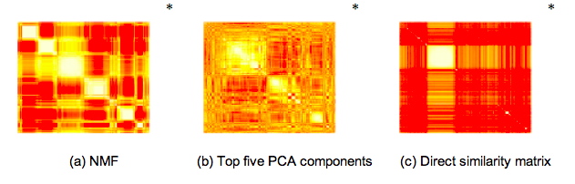
While PCA seems to over-constrain the problem and direct similarity seems to under-constrain the problem, NMF clustering results in five or six clearly identifiable clusters. We also found that within each of these clusters one type of annotated function tended to dominate, allowing us to infer broad categories for each cluster: Signalling, Photosystem, Phage, and two clusters of proteins with distinct but unknown functions. Finally – in practice, PCA is often combined with k-means clustering as a means to classify each site and function into a single category. Likewise, NMF can be used with downstream filters to interpret the projection in a “hard” or “exclusive” manner. We wanted to avoid these types of approaches.

Indeed, some of us had already had some success using NMF to find a lower-dimensional representation of these high-dimensional matrices. In 2011, Xingpeng Jiang, Joshua Weitz and Jonathan Dushoff published a paper in JMB describing a NMF-based framework for analyzing metagenomic read matrices. In particular, they introduced a method for choosing the factorization degree in the presence of overlap, and applied spectral-reordering techniques to NMF-based similarity matrices to aid in visualization. They also showed a way to robustly identify the appropriate factorization degree that can disentangle overlapping contributions in metagenomics data sets.

While we note the advantages of NMF, we should note it comes with caveats. For example, the projection is non-unique and the dimensionality of the projection must be chosen carefully. To find out how we addressed these issues, read on!

Using NMF as a tool to project and understand metagenomic functional profile data

We analyzed the relative abundance of microbial functions as observed in metagenomic data taken from the Global Ocean Survey dataset. The choice of GOS was motivated by our interest in ocean ecosystems and by the relative richness of metadata and information on the GOS sites that could be leveraged in the course of our analysis. In order to analyze microbial function, we restricted ourself to the analysis of reads that could be mapped to Pfams. Hence, the matrices have columns which denote sampling sites, and rows which denote distinct Pfams. The values in the cell denotes the relative number of Pfams matches at that site, where we normalize so that the sum of values in a column equals 1. In total, we ended up mapping more than six million reads into a 8214 x 45 matrix.

We then utilized NMF tools for analyzing metagenomic profile matrices, and developed new methods (such as a novel approach to determining the optimal rank), in order to decompose our very large 8214 x 45 profile matrix into a set of 5 components. This projection is the key to our analysis, in that it highlights the most of the meaningful variation and provides a means to quantify that variation. We spent a lot of time talking among ourselves, and then later with our editors and reviewers, about the best way to explain how this method works. Here is our best effort from the Results section that explains what these components represent :

Each component is associated with a “functional profile” describing the average relative abundance of each Pfam in the component, and with a “site profile”, describing how strongly the component is represented at each site. 

A component has both a column vector representing how much each Pfam contributes to the component and a row vector representing the importance of that component at different sites. Each Pfam may be associated with more than one component. Likewise, each component can have a different strength at each site. Remember, the music library analogy? This is how NMF achieves the effect of category “tags” which can label overlapping sets of items, rather than “folders” which must contain mutually exclusive sets.

Such a projection does not exclusively cluster sites and functions together. We discovered five functional types, but we are not claiming that any of these five functional types are exclusive to any particular set of sites. This is a key distinction from concepts like enterotypes.

What we did find is that of these five components, three of them had an enrichment for Pfams whose ontology was often identified with signalling, phage, and photosystem function, respectively. Moreover, these components tended to be found in different locations, but not exclusively so. Hence, our results suggest that sampling locations had a suite of functions that often co-occurred there together.

We also found that many Pfams with unknown functions (DUFs, in Pfam parlance) clustered strongly with well-annotated Pfams. These are tantalizing clues that could perhaps lead to discovery of the function of large numbers currently unknown proteins. Furthermore, it occurred to us that a larger data set with richer metadata might perhaps indicate the function of proteins belonging to clusters dominated by DUFs. Unfortunately, we did not have time to fully pursue this line of investigation, and so, with a wistful sigh, we kept in the the basic idea, with more opportunities to consider this in the future. We also did a number of other analyses, including analyzing the variation in function with respect to potential drivers, such as geographic distance and environmental “distance”. This is all described in the PLoS ONE paper.

So, without re-keying the whole paper, we hope this story-behind-the-story gives a broader view of our intentions and background in developing this project. The reality is that we still don’t know the mechanisms by which components might emerge, and we would still like to know where this this component-view for ecosystem function will lead. Nevertheless, we hope that alternatives to exclusive clustering will be useful in future efforts to understand complex microbial communities.


Full Citation: Jiang X, Langille MGI, Neches RY, Elliot M, Levin SA, et al. (2012) Functional Biogeography of Ocean Microbes Revealed through Non-Negative Matrix Factorization. PLoS ONE 7(9): e43866. doi:10.1371/journal.pone.0043866.


PhD Comics @phdcomics animated cartoon on #OpenAccess interview of me & Nick Shockey

I assume if you pay any attention to science satire/humor you are familiar with PhD Comics by Jorge Cham. If not, you must check it out. It is simply brilliant stuff. And thus I was completely floored when I was contacted about whether I wanted to be interviewed by Jorge for a video he was commissioned to make as part of Open Access week activities. I mean – I figging say no to almost everything these days but I said yes to this almost immediately. And so I did a phone interview with him and Nick Shockey from SPARC. And then Jorge worked his magic — and here it is.


Today’s "Overselling the microbiome award" Crohn’s Disease and Bacteria

Uggh.  Just read this: Specific bacterial species may initiate, maintain Crohn’s.  Basically it reports on a paper that showed a correlation between bacterial taxa and early Crohn’s disease.  The paper makes a big deal out of showing a correlation in the severity of pediatric Crohn’s and the types of microbes found.  Good.  That is useful.  But here is the thing.  It is a $&*#($@(& correlation.  They have NO IDEA if this is the result of the CD or the cause (or both).  To go around pushing the idea that this is about bacteria initiating CD is misleading.

The news release says “The work may ultimately lead to treatment involving manipulation of the intestinal bacteria.”  True.  The work may ultimately also lead to my screaming.  Oh wait.  It did already.

For more on Overselling the Microbiome see some of my other posts

As I have said many time.  I believe the human microbiome is VERY important.  I believe it probably plays a role in all sorts of human issues – health and disease.  But we need to be careful not to be misleading about what we know and don’t know … 

iTalk bug – help needed with partial / unclosed aiff file

Well, too long of a saga to post directly to Twitter so posting here.

Yesterday I recorded a review session for a class with iTalk https://itunes.apple.com/us/app/italk-recorder/id293673304?mt=8.  I recorded it on my iPhone 4S.

When I got home to upload the file and to convert it to an MP3 to share with the class I discovered that it seemed to not be there in the iTalk file list.

I thought – maybe I never formally “saved” the file but maybe iTalk kept the recording somewhere.

So I opened up iTunes connected to my phone and there it was in the Apps file area


I then copied the file to my desktop and no matter what I do I cannot seem to open it and /or extract audio out of it.  I have tried to open it a million ways with all sorts of desktop and online programs and nothing works.  My guess is somehow the file was not closed out correctly and thus even though it is 430 Mb it is viewed as empty by all the programs I have tried.

Anyone know a solution for this?

I have posted the file to Dropbox here.

Important read: Biotechniques discussion of DNA extraction in microbial studies

Very quick post here.  This is worth a read: BioTechniques – DNA Extraction: Overcoming Obstacles in Microbial Studies.  From their summary:

What are the most efficient methods to extract microbial DNA that accurately represents the community it is isolated from? Janelle Weaver reports on efforts to identify the best methods for DNA extraction from unknown frontiers in the human body and across the globe.”

It discusses among many things this fascinating paper: Flores GE, Henley JB, Fierer N (2012) A Direct PCR Approach to Accelerate Analyses of Human-Associated Microbial Communities. PLoS ONE 7(9): e44563. doi:10.1371/journal.pone.0044563

Note – I found out about this on the Twitter

//platform.twitter.com/widgets.js

On a related note see the paper from my lab on a metagenomic simulation we did a few years ago …

PLOS ONE: Metagenomic Sequencing of an In Vitro-Simulated …

Sampling, DNA extraction, and PCR, OH MY!

For the past week, we’ve been doing preliminary sampling, as well as some DNA extractions and PCR on samples from the saltwater and freshwater flasks of water that we filtered and the wall and protein skimmer from the saltwater tank. Those four samples have now been through PCR. Although we found DNA, but the gel prepared after the PCR failed. We also went back to the tanks to gather samples from a saltwater tank that is soon to be broken up to create two coral ponds.

UC Davis Magazine … not just tooting the #UCDavis horn …

I have just joined an advisory group for the UC Davis Magazine and I am really happy with their new direction. They are trying to make the magazine a little less “UC Davis is awesome” and more “Here are some interesting things to think about, with a UC Davis angle”. The new Fall Issue is a good example of this. There is for example a nice article by Sasha Abramsky about student involvement (or the lack thereof it). Plus there is a little video interview to go with the article. Perhaps even more “interesting” is the article on the future of higher education by Clifton Parker. Not exactly a glory piece about UC or UC Davis. Anyway … just thought I would put this out there. Any opinions on the magazine please send them my way – the staff there seem great and really interested in feedback.

Hi There!

I’m Sabreen Aulakh, one of the undergraduates working on the Undergraduate Aquarium Project! I’m a third year Microbiology major, and my plan is to go to medical school some time in the near future. I’m from San Jose, and I love to dance, specifically Bhangra, which is a traditional North Indian dance from Punjab, India. For those who are curious as to what it looks like, here’s a video of my team. (Nope, I’m not in this video because I was still in school.)

There’s just something about how those teeny tiny microbes have huge impacts on their environment that’s so darn interesting to me! I’m very excited to be a part of this lab, and can’t wait to see how this project unfolds. 🙂

Introductory Post

Yes, a boring title, but that’s exactly what this is. I am Alex Alexiev, second year biological sciences major. I’ve been thinking about a microbiology major for the past year or so, and this lab seems like a step in the right direction. I love aquatic systems and I think microbes are awesome, so I am extremely excited to research the two. Who knows what results the data will yield, but at the very least, it should be interesting.

Adaptation and Convergence in Regulatory Systems, guest post by David Pollock

Below is another in my series on “The Story Behind the Paper” with guest posts from authors of open access papers of relevance to this blog.  Today’s post comes from David Pollock in Department of Biochemistry and Molecular Genetics, University of Colorado School of Medicine.  Note – I went to graduate school with David and he is a long time friend.  This is why he apparently feels okay to call me Jon even though I go by Jonathan.  I have modified his text only to format it.  Plus I added some figures from his paper.


Adaptation and Convergence in Regulatory Systems

Guest post by David Pollock


Explanation


This is a guest blog post about a paper of mine just published in Genome Biology and Evolution, “SP transcription factor paralogs and DNA bindingsites coevolve and adaptively converge in mammals and birds“, and it amounts to my first attempt at an un-press release. You can tell it’s not a press release because I’m writing this about a week after the paper came out. This guest blog is coming about because I released an announcement about the paper to a few friends, and credited my old buddy Jon Eisen with having inspired me to move towards avoiding press releases. And I sure wouldn’t want this paper to be named in the same breath as the now infamous arsenic bacteria and Encode project press releases (although I note that a recent paper from my lab estimates that the human genome is at least 2/3 derived from repetitive sequence); also see posts by Michael Eisen and by Larry Moran. I had the vague idea that maybe Jon, Ed Yong, Carl Zimmer, or some other famous blogger would be so inspired by the move (and the fundamental coolness of the paper) that they would quickly write up a thoughtful interpretive summary for general audiences. Jon, however, being much to smart for my own good, suggested that I should write it up as a guest blog instead. So, here I am. At least I got Jon to agree to edit it.

The fundamentals of the paper

Okay then, why do I think adaptation and convergence in regulatory systems is cool and important? Well, first because I think a lot of important changes in evolution have to have come about through regulatory evolution, and yet there are huge gaps in our knowledge of how this change might happen. And I say this as someone who has spent most of his career studying (and still believing in the importance of) sequence evolution. Second, a lot of people seem to think that evolution of whole regulatory systems should be hard, because there are so many interactions that would need to change at the same time. Remember, transcription factors can interact with hundreds of different binding sites to regulate hundreds of different proteins. It makes sense that evolution of such a system should be hard. In this paper, I think we go a long way towards demonstrating that this intuitive sense is wrong, that functional evolution of regulatory systems can happen quite easily, that it has happened in a system with around a thousand functional binding sites, and that some of the details of how it happens are really interesting.

Fig. 1. Evolution of SP transcription factors. (A) SP1 binds preferentially to the GC box in placental mammals and birds (red) and to the ancestral GA box consensus in other vertebrates (black). Modifications in binding motif preferences along the phylogeny are denoted by red-filled circles. ‘Variable regions’ in zinc finger 2 (zf2-VR), containing all non-conserved sites in zinc finger 2 within vertebrates, are shown for SP1, SP3, and SP4. Site –13 (highlighted) is putatively responsible for the change in SP1 binding preferences. (B) Zinc finger 2 (zf2) of human SP1, SP3, and SP4. Each zinc finger contains an alpha-helix and two beta sheets (Philipsen et al. 1999; Dhanasekaran et al. 2006). Red and gray columns denote sites non- conserved across vertebrates; all are contained in the boxed variable region (zf2-VR), comprising sites -13 to -8. Site +3 binds directly to the convergent A/C fourth site of the GC box. (C) SP1 binds to the DNA via zinc fingers 1-3 (zf1-zf3), where zf2 binds to the three central nucleotides of the GC box (GGGCGG) (Philipsen et al. 1999; Bouwman et al. 2002; Dhanasekaran et al. 2006). Site -13 (red) is only 9.5 Å from site +3 (green) and directly contacts the neighboring site (site +4) (Bouwman et al. 2002; Oka et al. 2004; Dhanasekaran et al. 2006).

Aside from promoting the science, the other reason I want to blog about this paper is that I think it is a great demonstration of how fun and how diverse science can be. To support its points, it brings in many different types of evidence, from genomics to population genetics to protein structure prediction. It is also a good example of using only publicly available data, plus a lot of novel analysis, to see something interesting that was just sitting there. I think there must be a lot more stories like that. All of that Encode data, for example, is bound to have some interesting undiscovered stories, even with 30 papers already published. The most fun part, though, which I don’t think I can fully recreate without jumping up and down in front of you, was just the thrill of discovery, and the thrill of having so many predictions fall into place with data from so many different sources.

I don’t recall another project where we would say so many times, “well, if that is the explanation, then let’s look at this other thing,” and bam!, we look at the other thing and it fits in too. It started with Ken Yokoyama, the first author, walking into the lab having just published some pretty good evidence that the preference for the SP1-associated binding site (the GC-box) was newly evolved in the ancestor to eutherian mammals. Well, if that’s true, there ought to be a change in the SP1 protein sequence that can explain it. Sure enough, there is, and SP1 is a very conserved protein that doesn’t change a lot. Hmm, we have more sequences now, let’s look to see if preferences changed anywhere else on the phylogenetic tree. Yes, in birds. Well, there ought to be a change in bird SP1 that can explain that; sure enough, there is, and it’s at the homologous position in the protein. Looking good, but is it in the right place in the protein? Yes, in the right domain (zinc finger 2, or zf2), right behind the alpha helix that binds the nucleotide for which the preference changed. And before you ask, Ken ran a protein structure prediction algorithm on the amino acid replacements in SP1, and the predicted functional replacements in bird and mammal are predicted to bend the protein right at the point where it binds the nucleotide at which the preference changed. You might then ask if this amino acid replacement does anything to the binding function, and the answer again is “yes”. This time, though, we were able to rely on existing functional studies, which showed that human SP1 binds 3x better to the GC-box binding site than it does to the ancestral GA-box (more on this below).

Fig. 2. Birth-death rates of the SP1 binding motif in mammals. Birth rates (α) denote the probability (per year) that an unoccupied position will gain a binding site; death rates (β) give the probability (per year) that an existing binding site is lost. Branches in the mammalian phylogeny were partitioned into three groups: early eutherian mammals (red), late eutherian mammals (black), and GA box-preferring non- eutherian mammals (blue). Birth and death rates of each group were estimated for the GC box (GGGCGG), GA box (GGGAGG), and the non-functional motif GGGTGG (Letovsky et al. 1989; Wierstra 2008).

The coup de grace on this residue position as the source of convergent functional changes, though, came with consideration of the other transcription factors that interact in this regulatory system (that is, they bind to the same binding sites to modify transcription). If there was a functional change in the transcription factor, driving modified changes in the binding sites, then it seems that this should affect the other transcription factors in the system. It could have been hard to figure anything out about these other transcription factors, but luckily they consist of SP3 and SP4, two paralogs of SP1. This means that they are ancient duplicates of ancestral SP proteins, they share a great deal of conserved sequence with SP1, and they bind with similar affinities to the SP1 binding consensus. And they have not just one or two, but between the two proteins, in birds and mammals, at least eight convergent amino acid replacements at the homologous position that putatively modified binding in SP1. And the substitution that occurs is the same replacement that occurred in bird SP1. Based on sequences from jawed fish and frogs, this position was almost completely conserved in the SP3 and SP4 paralogs for 360 or 450 million years of evolution. The convergent changes all occurred in only the last 100 million years or less of eutherian and bird lineages. We believe that the simplest interpretation is that, over tens of millions of years, a functional replacement occurred at the SP1 protein, adaptively driving hundreds of SP1 binding sites to convert from ancestral GA-boxes to derived GC-boxes, and that this then drove the same functional replacement in coregulatory paralogs SP3 and SP4.

Timing and a mechanism

Two questions often comes up at this point, “how do we know the order of these events?” The simplest piece of evidence for the order of events comes from the order of fixation of substitutions. The amino acid substitutions in SP1 are fixed in all eutherian mammals and all birds, indicating that they occurred on the branches leading to these taxon groups. The increase in GC-boxes occurred over time at different loci, mostly on the branch leading to eutherian mammals and on the branches immediately after that split the most ancient eutherian mammal groups. The replacements in SP3 and SP4 occurred later in the evolution of eutherian mammals and birds, and did not occur in all lineages. One might be able to come up with complicated scenarios whereby changes in some SP1 binding sites occurred first, driving the fixation of the SP1 replacement, followed by further selected changes in other SP1 binding sites, but we think our hypothesis is simpler.

Fig. 3. Population frequencies of an adaptive mutant transcription factor and its binding sites.  (NOTE – SOME DETAIL OF LEGEND LOST IN COPY/PASTE – SEE PAPER). (A) Shown are the population frequencies of the adaptive mutant transcription factor allele (blue), which first occurs in a single heterozygous individual at generation (population size:   ). The total population frequency of the novel binding consensus (BOXC) and the initial wild-type binding motif (BOXA) are shown in red and black, respectively. We assume a small adaptive benefit for the adaptive transcription factor SPC binding to BOXC (relative fitness , where ) over the wild-type transcription factor and its motif (relative fitness ). Maladaptive binding events (SPC binding to BOXA or the wild-type transcription factor binding to BOXC) have reduced fitness ( , where ). Population frequencies of SPC, BOXA, and BOXC are given on the left for the first 20,000 generations and on the right for 150,000 generations. (B) Evolution of the adaptive trans-factor and binding sites under a semi-dominant model. SPC binding to BOXC is assigned relative fitness for individuals heterozygous for the transcription factor genotype (     ) and for individuals homozygous for the mutant transcription factor. (C) The single binding site locus model. In contrast to the previous model, each locus is restricted to no more than one binding motif (either BOXA or BOXC).

Other pieces of evidence also come into play. The question about the order of events can be rephrased as a question of whether neutral forces, such as changes in mutation rates at binding sites, could have altered the frequency of the alternative binding sites, with SP1 (and then SP3 and SP4) playing functional catch-up to better match the new binding site frequencies. It seems to us that such a model would predict that the binding sites would have changed irrespective to the function of the proteins that they regulate. (As an aside here, we note that our binding site data set is best described not as a definitive set of SP1-regulated promoters, but as a set that is highly enriched in functional SP1 binding sites. We don’t trust binding site function predictions, and the putative binding sites inclusively considered were those that had either the ancestral GA-box or the derived GC-box in the functionally relevant region prior to the transcription start site. Such sites are highly enriched for categories of genes known to be under SP1 control.) But the binding sites that shift from GA-boxes to GC-boxes are even further enriched for categories of genes under SP1 control. This is not compatible with the neutral mutational shift model, but is compatible with the idea that the subset of our sites for which SP1 regulation is most important are the ones that were most likely to adaptively shift box type when the SP1 with altered function became more frequent.

The mutational driver model also predicts a simple shift in frequencies driven by mutation. For example, GA-boxes might tend to mutate into GC-boxes, and conversely, GC-boxes might tend to be conserved and not mutate to GA-boxes. What I haven’t told you yet, though, is that the excess GC-boxes do not tend to be produced by mutation from GA-boxes, but rather they tend to be produced as de novo mutations from non-SP1 box sequences. They are produced by a wide variety of mutations from a wide variety of different sequences that are slightly different from the canonical SP1 binding sites. Furthermore, the GC-boxes appear in a burst of birth early in eutherian evolution, but the GA-boxes don’t disappear in a burst at the same time. Rather, they simply fade away slowly over time in lineages that have evolved GC-boxes. It is not clear to us that this can be explained using a mutation model, but it is easily explained by a model in which the SP1 replacement has adaptively driven hundreds of binding site convergent events. This is then followed by the slow mutational degradation of the GA-boxes, which don’t matter so much to function anymore. It is also worth mentioning that the GC box preference doesn’t seem to correlate with GC content, as several fish lineages are just as high in GC content as humans, but do not have the GC-box preference.

Fig. 4. Structural changes of SP1 zinc finger 2 (zf2) following replacements at site -13. (Top) Comparisons of predicted lowest-energy zf2 structures between the native human peptide (-13M), and peptides following replacements to the ancestral valine (M-13V) and bird isoleucine (M-13I) at site -13. Structural alignments were conducted according to residues on the 5’ end of the peptide (residues -16 to -12). Both -13M and M-13I peptides showed displacement of residues 5’ to the DNA-contacting alpha-helix (sites -6 to -1) compared to the ancestral valine peptide. No such displacement was seen between -13M and M-13I. All three peptides aligned closely at the 3’ end of the alpha-helix (sites +6 to +10), reflecting structural modifications at the 5’ end of the alpha-helix. (Bottom) Distances between alpha carbons prior to and within the alpha-helix (blue and orange, respectively). Comparisons between the native human peptide and M-13V (left) and between M-13I and M-13V (center) show closely-aligned residues at the 3’ end of the alpha-helix and increasing displacement towards the 5’ end. These modifications begin around site +3, which directly contacts the A/C evolving site of the SP1 binding motif (Philipsen et al. 1999; Bouwman et al. 2002; Dhanasekaran et al. 2006). No such region- specific displacement between -13M and M-13I was observed between -13M and M-13I (right).

The observed pattern of binding site evolution is also predicted by a model we developed to determine if the evolution of transcription factors and their binding sites could be explained in a population genetics framework. We asked, what is a possible mechanism by which these changes might occur? At the beginning of this post, I noted that a lot of people seem to think that evolution of complex multi-genic regulatory systems should be hard. We reasoned, though, that if the beneficial effects of a newly evolved binding interaction were dominant or semi-dominant (that is, the beneficial effects in the heterozygote were at least partly visible to selection), then it might be possible for evolution to be achieved through a transition period in which both the transcription factor and its cognate binding sites were polymorphic.

We developed both a deterministic and a stochastic model, and found that, indeed, even small (nearly neutral) selective benefits per locus can drive the entire system to fixation. What happens is that as long as there are some binding loci with the new binding box in the system, then a new variant of SP1 with a preference for the new binding box, and an associated small selective benefit, will at first rapidly increase in frequency. It won’t immediately fix though, but rather will maintain a temporary steady state, kept down in frequency by the deleterious effects that new variant homozygotes would have with the large number of binding loci that are homozygous for the ancestral binding box. Once it has reached this steady state, it exerts selective pressure on all the binding loci to increase the frequencies of the new binding boxes at each locus. Much more slowly then, the frequency of the new transcription factor variant increases, in step with the frequencies of new binding boxes at all the binding loci.

Although our studies do not prove that our population genetics model is the exact mechanism for adaptive changes in SP1, it provides proof of concept that it is not difficult for such a mechanism to exist.

Where does this leave us?

At the broader level, this paper shows that small selective benefits can drive the evolution of complex regulatory systems (in diploids, at least; sorry to leave out the micro folks, Jon). Furthermore, it demonstrates, we believe convincingly, that adaptation has driven the evolution of the SP1 regulatory system, driving convergent evolution at many hundreds of promoters, and in SP3 and SP4. It thus strongly counters prevailing notions that such evolution is hard. We hope that this work (along with other work of this kind) will drive others to further pursue the broad questions in regulatory evolution. Are the details of the SP1 system common to other regulatory systems?

A particularly important question, which we did not focus on here, is whether the evolution we have described involves only static maintenance of the status quo in terms of which genes are regulated. One has to wonder, though, whether if it is easy to evolve a static regulatory system, that it is not therefore easier than previously believed to modify regulatory connections in a complex regulatory system. There are hints of such changes here, in that genes that may have gained novel SP1 regulation (that is, gained a GC-box when they did not have the ancestral GA-box) tend to be enriched in certain GO categories (see Table 2 in the paper).

For SP1, it will be interesting to see if good stories can be developed for to explain why this adaptation should have occurred specifically in birds and eutherian mammals. The ideal story should include both a biophysical mechanism, and a physiology-based mechanism, such as the possibility that warm-bloodedness played a role. Both of these avenues promise to be complicated, if addressed properly. For example, we believe that it will be more meaningful if a biophysical mechanism can address the need for specificity as well as strength of binding, perhaps by utilizing next-generation sequencing approaches to measure affinities for all relevant binding site mutations (see, among others, our recent paper on this topic, Pollock et al., 2011). Are there interactive roles for selection on transcription factor concentration as well as efficiency and selectivity? What trade-offs exist among binding efficiency and binding site duplication? Do different types of regulatory connections evolve differently? These are all great questions for future research.

Addendum

I’ll try to add further comments if questions or issues come up. I’m particularly interested to see how this non-press release guest log post works as an experiment to promote the paper and the work. I also hope it will promote Ken Yokoyama’s career (he’s now at Illinois, and will probably be looking for an academic job in the next year or two). He did an awesomely diverse amount of work on this, learning how to work in totally new areas for him, such as population genetics, birth/death models, and protein structure prediction. He dove into these areas unhesitatingly to pursue the logical scientific questions, developed novel analyses, and did a great job. This paper represents a fundamental contribution and a fantastic advertisement for Ken’s abilities.